UI/UX DESIGN — INTERNSHIP
2024
case study
Heatmap Portal Redesign
Overview
It was July 2024 when I was onboarded with the challenge of reimagining the interface for Heatmap during my internship at Full Sprint. Heatmap (Heatmap.com) is an innovative analytics platform that helps small businesses gain insights into user interactions on their websites. By visualizing the most clicked areas (heatmaps), providing screen recordings, and offering AI-driven insights, Heatmap empowers business owners to make data-driven decisions for their online storefronts. With new features constantly being added, the existing interface became increasingly fragmented and difficult to navigate. This case study details the redesign process aimed at creating a cohesive, scalable experience that aligns with Heatmap’s updated design language and expanded feature set.
Details
1. Problem Statement
Imagine walking into a house where new furniture had been added whenever needed, without consideration for the overall layout or style. A modern sectional sofa sits next to a vintage rocking chair, while a minimalist coffee table clashes with an ornate cabinet. That's what Heatmap's interface had become – a collection of mismatched features that, while individually functional, created a confusing and disjointed experience. The result:
- Inconsistent navigation: The UI lacked a clear hierarchy or logical grouping of features.
- Fragmented design: The old interface felt incoherent as new modules were added arbitrarily.
- Increased cognitive load: Users struggled to find and learn new features in the disorganized layout.
- Unscalable structure: The existing framework could not smoothly accommodate expanding capabilities.
Goal: Redesign the Heatmap portal so it presents a unified visual language, improves feature discoverability, and streamlines user workflows for analyzing data—all while remaining flexible for future updates.
2. Research
2.1 Competitive Analysis
Before jumping into solutions, I needed to understand what Heatmap was up against. I started by examining other analytics platforms, noting how they handled similar challenges. Key observations included:
- Clear, Collapsible Navigation as a common strategy for handling multiple analytics features.
- Split Views for showing data alongside a list for easy navigation.
- Modular Dashboards that let users see at-a-glance metrics quickly and customize their data.
These insights guided the redesign’s approach to navigation, layout, and data presentation.
2.2 Platform Evaluation
I conducted a deep dive into the existing platform to understand its structure and usability challenges. This involved systematically mapping out features, analyzing navigation flows, and identifying inconsistencies.
- Comprehensive Feature Audit: Mapped out every feature and its location in the portal.
- Information Architecture Review: Assessed the hierarchical structure of pages and sections.
- Navigation Pattern Analysis: Noted user pathways and identified bottlenecks.
- Visual Consistency Check: Evaluated UI elements for brand alignment (where they existed).
Key Findings
- Scattered Features: Users had to jump between multiple, unconnected sections for related insights.
- Inconsistent UI Patterns: New feature additions led to mismatched button styles, card layouts, and icons.
- Navigation Bottlenecks: Switching between heatmap views or applying filters took multiple steps.
- Limited Scalability: The existing structure was not well suited to handle a growing array of features.
3. Design Process
With a tight timeline ahead, I needed to move efficiently. Drawing inspiration from Heatmap's public preview page—which showcased their modern visual direction—I began sketching out solutions. Instead of getting caught in lengthy wireframing cycles, we made the bold decision to jump straight from low-fidelity sketches to high-fidelity designs.
3.1 Goals
- Establish a Cohesive Design System: Ensure visual and functional consistency across features.
- Improve Navigation & Feature Discoverability: Simplify how users move between different toolsets (heatmaps, screen recordings, AI insights).
- Streamline Workflow: Reduce unnecessary clicks, unify related features, and present data more clearly.
- Maintain Familiarity: Provide a smooth transition for existing users so they can quickly adapt.
3.2 Design Foundation
A pivotal reference point was an existing public preview page, approved by stakeholders, that showcased a modernized color palette and typography. By applying this established visual style consistently throughout the platform, the redesign aimed to unify existing features, accommodate new ones, and keep the interface intuitive.
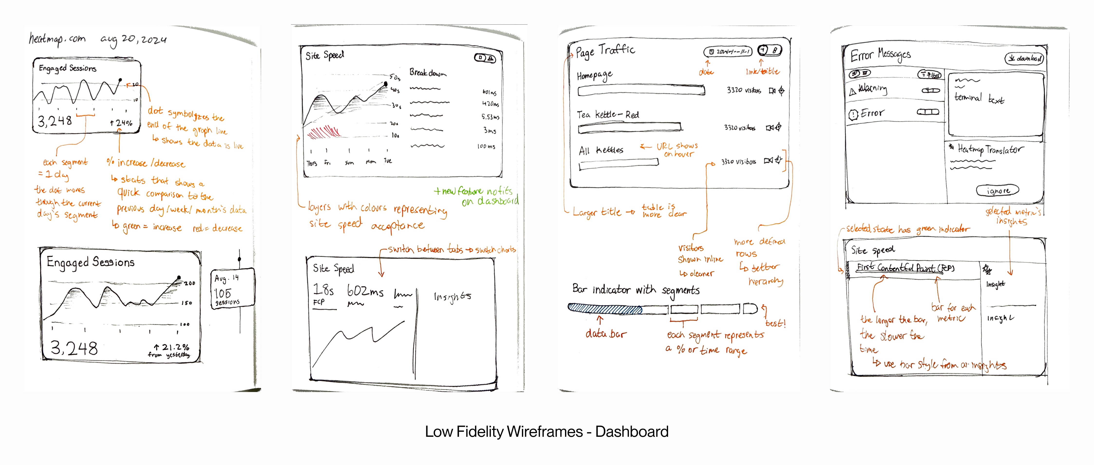
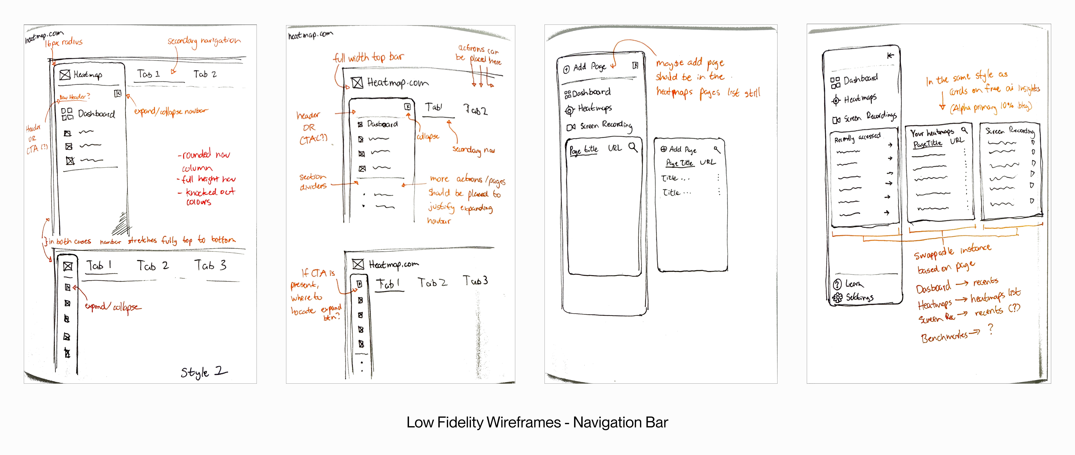
3.3 Wireframing & Prototyping
- Low-Fidelity Wireframes: I started by sketching rough layouts for the navbar, dashboard, and key pages. This helped clarify the overall structure and key user flows.
- Direct Jump to High-Fidelity: Due to a tighter timeline, we skipped the medium-fidelity stage. After reviewing the low-fidelity concepts with colleagues, I iterated directly in high-fidelity wireframes to refine visuals, layout, and components.
- Advanced Figma Prototype: I built a fully interactive and size-responsive prototype in Figma, leveraging Auto Layout to ensure components and pages could scale or reflow easily. This prototype included:
- Clickable navigation elements
- Full-page transitions
- Interactive filters and tabs for heatmaps and recordings
- Responsive breakpoints to demonstrate adaptability
- Final Stakeholder Presentation: I presented the high-fidelity prototype to the Full Sprint and Heatmap team. Early feedback was generally positive, though Heatmap highlighted certain areas as needing additional refinement.
4. Design Solutions
4.1 Navbar Redesign
- Primary Color Emphasis: Adopted the standout color from the public preview page for brand consistency.
- Simplified, Collapsible Navigation: Consolidated links for the dashboard, heatmaps, screen recordings, and settings into a clear, collapsible menu.
- Pinned Items: Introduced a dedicated area for pinned heatmaps or screen recordings, providing quick access to frequently analyzed data.
Anticipated Outcome: A more intuitive, consistent navbar that reduces clutter and highlights frequently used features.
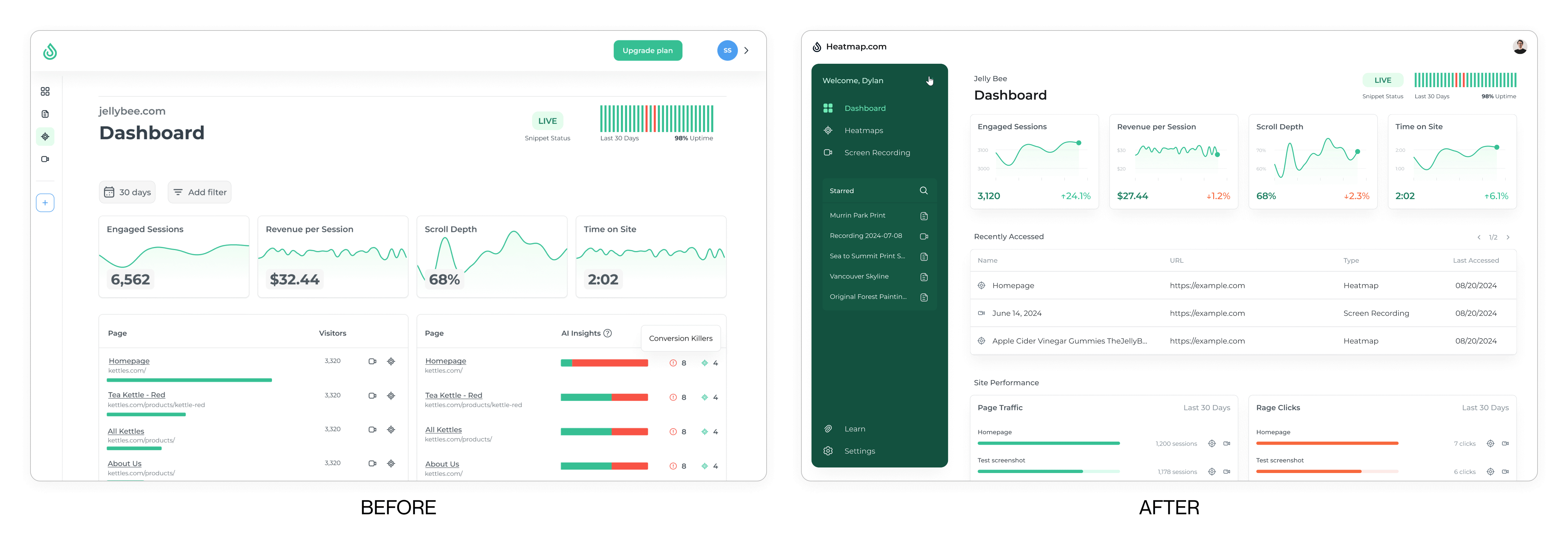
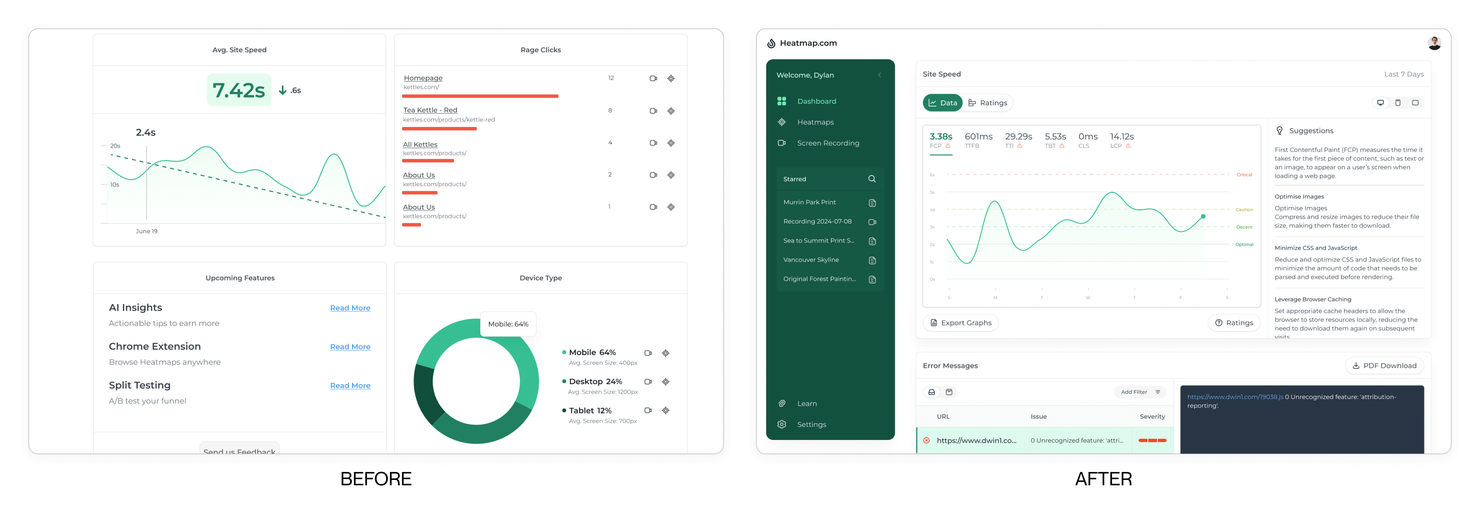
4.2 Dashboard Improvements
- At-a-Glance Visuals: Enhanced summary charts with x- and y-axis labels, data markers, and tooltips.
- Key Metrics: Surfaced essential performance metrics (e.g., total clicks, conversion rates) in a card-based layout at the top.
Anticipated Outcome: A quick overview of site performance that doesn’t overwhelm users, with room for future expansions.
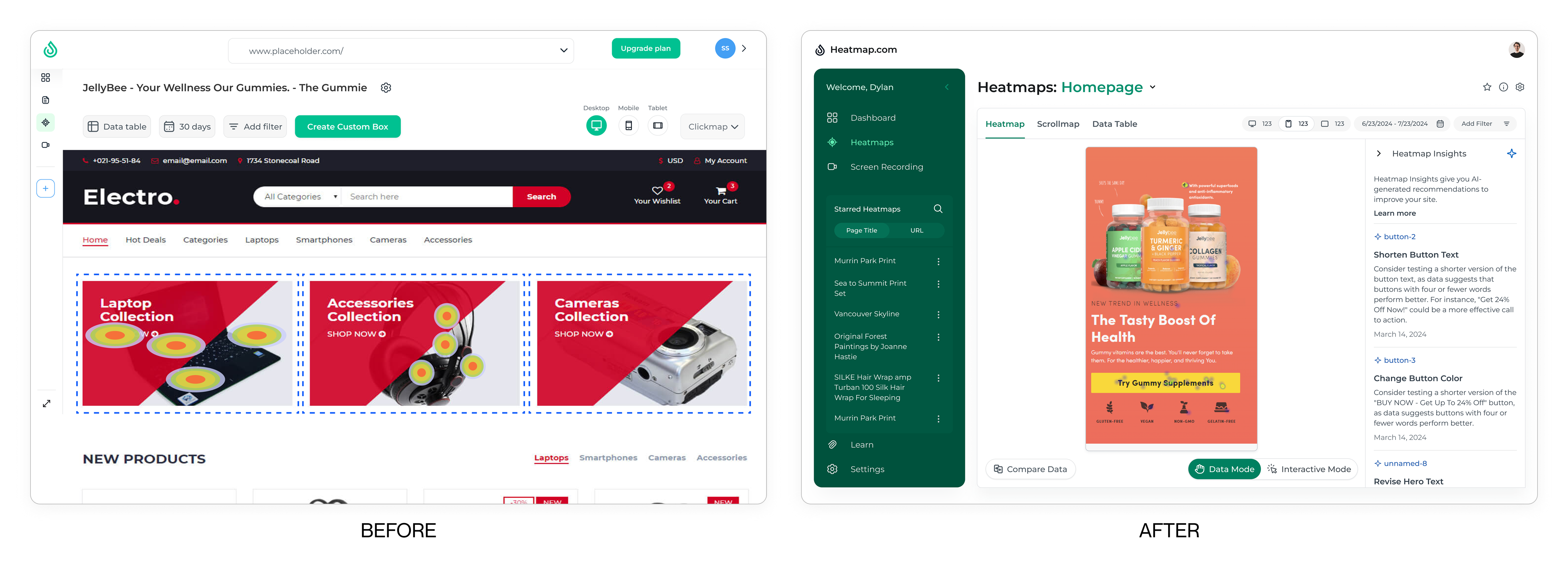
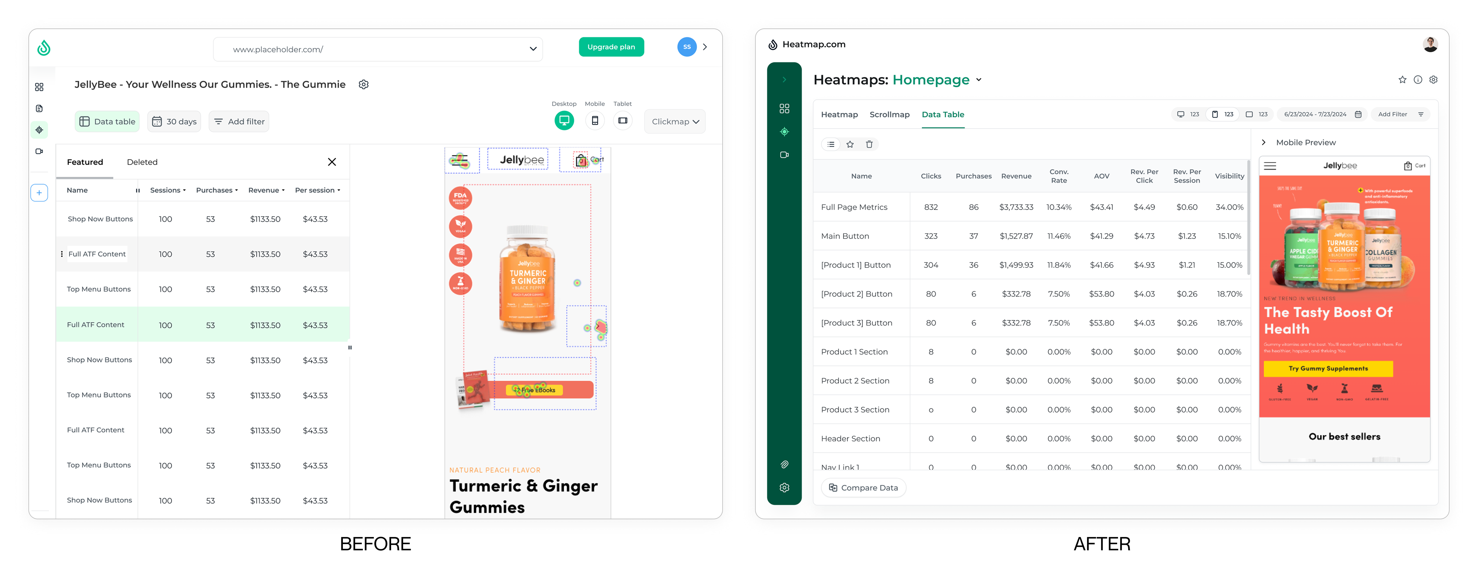
4.3 Heatmaps Section Overhaul
List Page
- Full-Page List View: Eliminated the cramped list that was in the navbar by dedicating a full page to browsing heatmaps.
- Expandable Rows: Incorporated metadata like device type, date range, and tags without cluttering the primary list view.
Heatmap Viewer
- Clean Data Cards: When clicking on hotspots, the pop-up cards clearly display click counts and percentages.
- Separated Controls: Grouped filters, device switcher (desktop, mobile, tablet), and mode toggles (data vs. interactive) at the top.
- Tabbed Layout: Introduced tabs for Heatmap View, Scrollmap View, and Data Table, improving the information architecture.
- AI Insights Integration: Partnered with a colleague to incorporate automated insights on user behavior.
Anticipated Outcome: A flexible, all-encompassing space for analyzing heatmap data, with a cleaner layout that reduces user confusion.
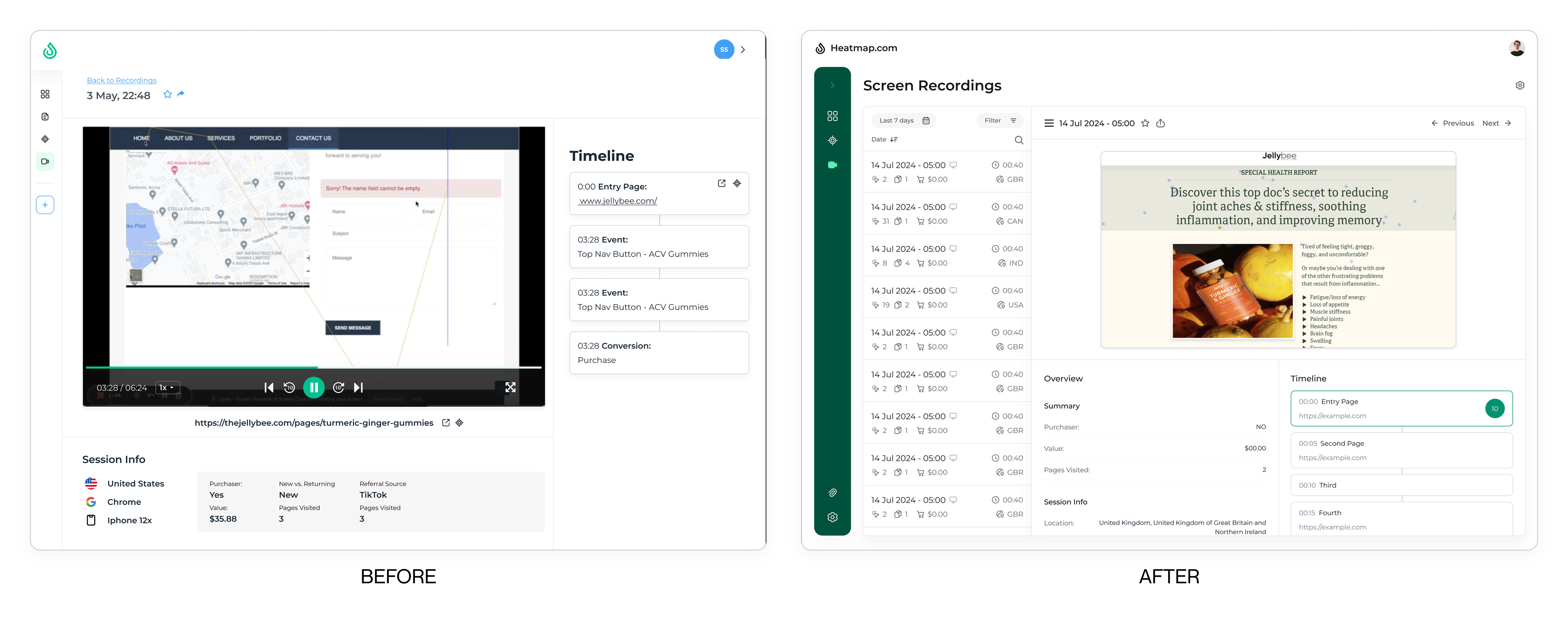
4.4 Screen Recordings Refresh
- Consistent Visual Language: Unified fonts, colors, and buttons with the rest of the new design.
- Dedicated List View: Introduced clearer pagination, sorting, and filtering of session recordings.
- Enhanced Viewer: Presented recording metadata (e.g., session duration, user location) alongside the playback to offer broader context.
Anticipated Outcome: An easier way to locate and review session recordings, maintaining visual consistency with other sections.
4.5 Kaitlyn’s Journey - Real World Example
To illustrate how these design changes come together, meet Kaitlyn, a marketing specialist for a small organic skincare e-commerce store.
- Collapsible Navigation & Pinned Items
- Use Case: Kaitlyn logs into the Heatmap portal to track performance after running a new campaign.
- Before: She had to click through disjointed menus to get to her most-used heatmaps.
- Now: She immediately notices the collapsible navigation on the left. It’s clearly labeled, paired with an icon, and streamlined. Below the tabs is the Pinned section, where she’s added her newly launched “Rose Glow Serum” heatmap. She clicks it to jump straight into analysis—no more hunting through multiple tabs.
- Heatmaps Section Overhaul
- Use Case: Kaitlyn needs to identify user interaction hotspots for the new product page.
- Before: Navigating to the heatmap was difficult in the cramped sidebar, data visibility controls were scattered.
- Now: She clicks “Heatmaps” in the simplified nav, landing on a full-page list view of all her site’s heatmaps. She opens the “Rose Glow Serum” heatmap, and a clean data card pops up when she clicks on the hotspots, showing precise click counts and percentages. The separated controls at the top allow her to toggle device type or filter date ranges without losing her place. The new tabs to switch between heatmap, scrollmap, and data table means she know where to find the data she is looking for.
- Screen Recordings Refresh
- Use Case: Kaitlyn wants to watch real user sessions to see how visitors scroll and click around the product page.
- Before: The session recordings panel was visually inconsistent, and recordings were hard to sift through.
- Now: She heads over to Screen Recordings, where a dedicated list view with filtering lets her quickly find recordings tagged “Rose Glow Serum.” The enhanced viewer displays session duration, user device, and location information right alongside the playback. Kaitlyn notices several users never hover over the “Add to Cart” button—confirming the heatmap analysis and AI insights.
Takeaway
By guiding Kaitlyn through these key tasks, the redesigned portal addresses her specific pain points: scattered features, inconsistent UI patterns, and difficulty in quickly synthesizing user behavior data. Having everything organized under the new navigation system, with pinned items for rapid access, empowers Kaitlyn to make informed decisions about layout adjustments—ultimately enhancing the user experience on her e-commerce site.
5. Feedback & Next Steps
Although the redesign did not reach full implementation during my internship:
- Initial Internal Reactions: Stakeholders and team members responded positively to the unified visual style and simplified navigation.
- Constructive Critiques: Toward the end of my internship, certain aspects—like the pinning mechanism’s discoverability and the default dashboard layout—were called out for needing refinement.
- Testing Plans: True user testing and broader data-driven validation are pending implementation in a future development cycle.
6. Reflections
This project taught me valuable lessons about balancing familiarity with innovation, designing for future growth, and working within time constraints. While I couldn't see the project through to implementation, I left knowing we had created a solid foundation for Heatmap's future growth.
Challenges
- Familiarity vs. Change: Balancing a recognizable interface for existing users with introducing innovative layouts.
- Scalability: Ensuring designs support future features—like extended AI insights—without overcomplicating the structure.
- Research Data: The smaller scaled company and limited resources meant user testing prior to the redesign could not be collected.
- Time Constraints: The internship timeline meant I could not see the project through full user testing or final implementation.
Future Opportunities
- Refine Pinning & Dashboard Configuration: Provide ways for users to customize pinning and dashboard widgets to match their specific analytics needs.
- Deeper User Testing: Gather feedback through usability studies once the redesign is live, then iterate based on real-world insights.
Conclusion
By applying a new visual style and carefully reorganizing Heatmap’s navigation and data presentation, this redesign aims to streamline how users interact with heatmaps, screen recordings, and AI-driven insights. While fully implementing and testing these updates remains a future task, the positive initial response from Heatmap.com’s internal team and the constructive critiques offer a solid starting point for iterative improvement.