UI/UX DESIGN — HACKATHON
2024
2nd place overall
YRConnect


Overview
YRConnect is a mobile app concept aimed at transforming how the residents of York Region interact with their community and access essential services. The app provides a centralized platform for booking study rooms and sports facilities, participating in community polls, staying informed about trash pickup schedules, and much more. Designed with accessibility and user-friendliness in mind, YRConnect streamlines access to vital information and fosters a stronger sense of community within York Region.
Details


With YRHacks of York Region being the third hackathon I attended, I had more experience going into the hackathon and knew what would and wouldn’t work. The best design award was up for grabs, which meant another design project for this hackathon. I decided to partner with my friend Aubree this time. Together we would design a forward-thinking mobile app for the residents of York Region. The app is designed to be accessible while exploring new design patterns and elements. At the end, instead of winning best design, we won 2nd place of the entire hackathon! Here’s the story about how YRConnect, a testament to the power of design, came to fruition at YRHacks 2024.
YRHacks was a hybrid hackathon, so the first day took place online and the second day was in person. Before the hackathon started, we started to brainstorm ideas. Our first idea was actually an app that would gamify your daily tasks. However, we didn’t follow through with this idea because we knew that the to-do list app market was already extremely saturated, and just another to-do list app wouldn’t really contribute much or solve any issues people face. That’s when we got the idea of an app for our local community, York Region. Aubree and I both knew that it was difficult to access municipal and regional services because of how fragmented each website was. Residents would have to go to different URLs, tabs, and interact with several different interfaces to complete simple things like booking a study room. Our idea was to consolidate all online municipal services into one app, while also adding the ability for residents to take part in community polls and events, allowing more people’s voices to be heard.
After the hackathon started and this idea was formulated, we started planning out all the features and project tasks. Planning is essential in a successful hackathon project, so we made sure to include everything we would need to work off in this plan. Another thing to consider was a business model, but since this would be a government app, it would be government funded. This meant no ads or in app purchases! We also brainstormed names in this phase, but we would ultimately finalize the name of the app before we submitted at the end of the hackathon. Since it was only the two of us working, it was easy to split up the tasks based on what we were comfortable designing.
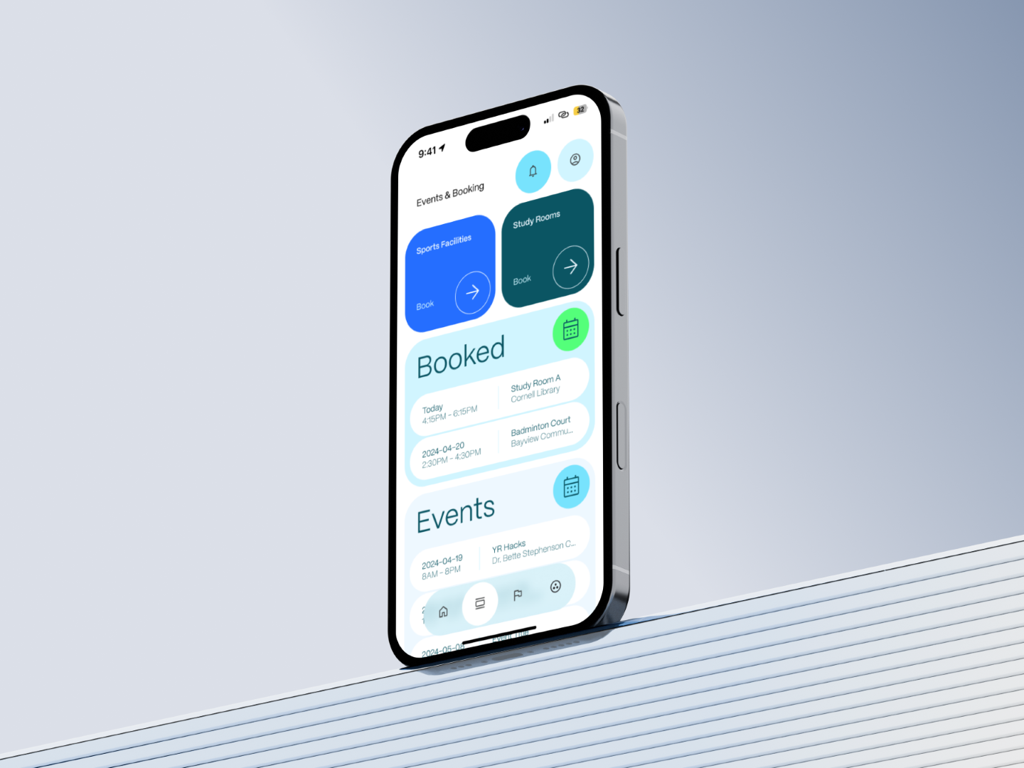
We then immediately got to work on wireframing. We started on paper, creating some preliminary sketches on what we want the style of the app to be. Designing on paper first is extremely beneficial since it allows you to iterate quickly without the hassle of perfecting everything on Figma. Since there was a lot of different information that needed to be shown to the user, the home screen needed to be an easy-to-read dashboard. Information had to be easily found but the interface had to be uncluttered. We opted for different coloured cards, which clearly separated the content. Accessibility was another major aspect of our design. As an app targeted towards all York Region residents, the user interface had to be readable and easy understood by people of all ages. This meant high contrast, bold text, clear hierarchy, and distinct colours.
Speaking of colours, we opted for tones that were eye catching and high contrast but not extremely saturated. Of course, since it’s an app for York Region, we had to include a shade of blue. We also incorporated a light shade of green as well as darker hues to give us options in creating contrast and separation between elements. We also chose to use the clean and modern Mori typeface from the Pangram Pangram foundry.
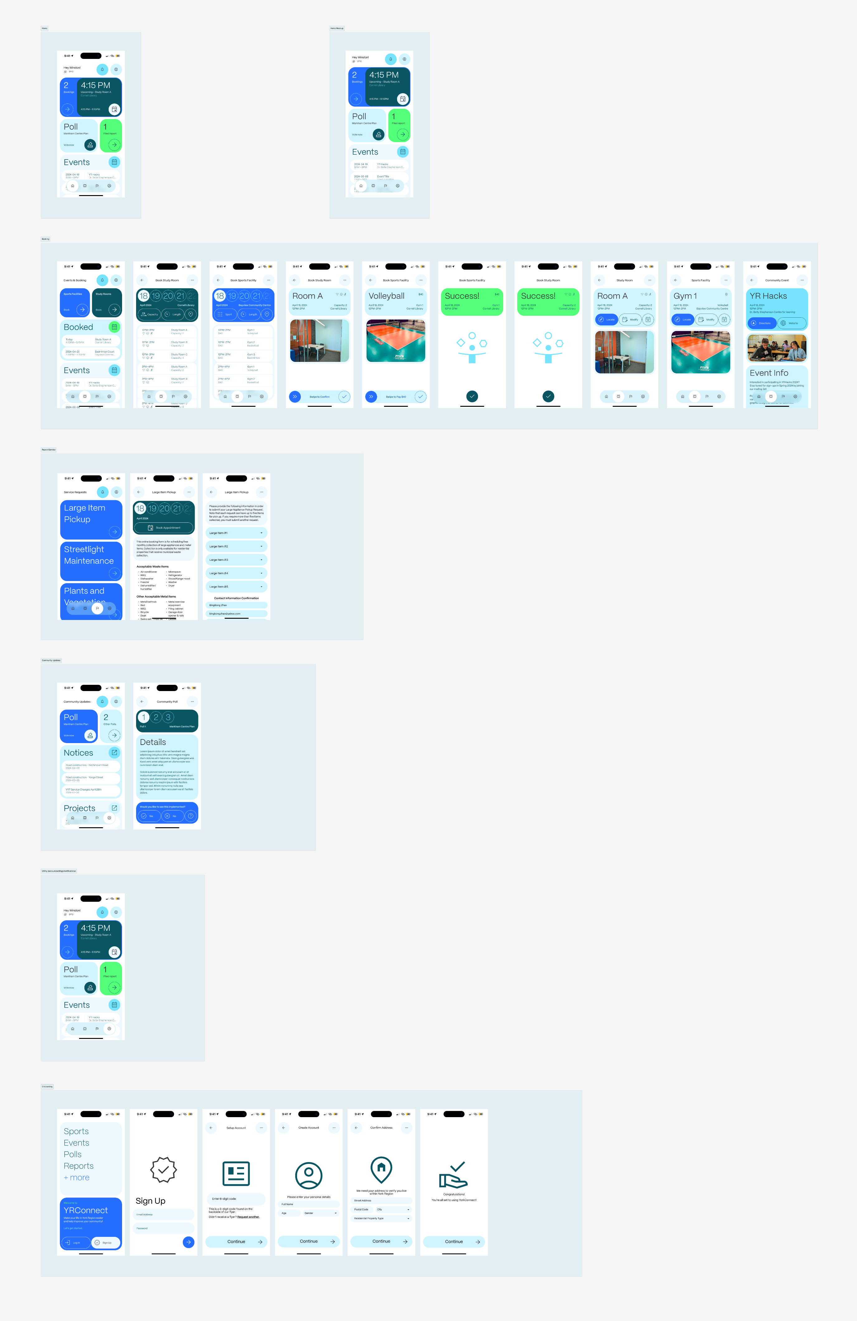
As the hackathon progressed, we moved on to creating high fidelity wireframes on Figma. Two features that greatly improved our productivity were components and auto-layout. Components allowed us to reuse elements like the navigation bar or headers for every frame, while auto layout made it easy to create the grid used on the dashboard.
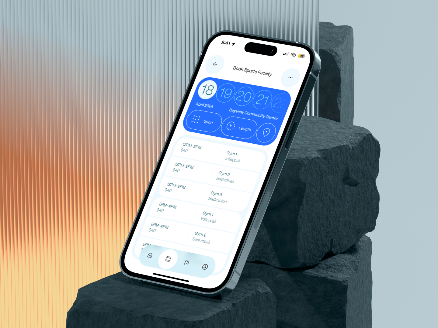
After establishing our design system, we dove into creating the key features of YRConnect. One of our primary focuses was the facility booking system. We designed an intuitive flow that allows residents to easily reserve study rooms at local libraries or book sports facilities for recreational activities. The interface features a calendar view with available time slots clearly marked, and users can filter facilities based on location, type, and amenities. We made sure to include detailed facility information, including accessibility features and parking availability, to help residents make informed decisions.
The community engagement features were another crucial aspect of YRConnect. We created a dedicated section for community polls and surveys, where residents can voice their opinions on local initiatives, from proposed infrastructure projects to community event planning. To ensure maximum participation, we implemented push notifications for new polls and made the voting process as straightforward as possible. The results are displayed through clear, accessible visualizations that help residents understand the community's collective voice.
With our high fidelity wireframes complete, we created interactive prototypes in Figma to demonstrate the app to the judges. After completing the prototypes and submitting our project, it was time to present YRConnect to the judges. We had prepared a concise presentation, and we improvised what we were going to say because of the limited time provided. We explained our design choices and the reasoning behind our user-centred approach. The judges seemed impressed and interested in our project, and they liked the visual design of the app. We were hopeful that our visuals and UX design would earn us the Best Design Award, but when they announced that YRConnect had won 2nd place overall, we were even happier! It was incredibly rewarding to see that our hard work and dedication had paid off.
This experience reinforced some key takeaways for me. Firstly, a successful hackathon project requires meticulous planning and a clear understanding of your product and target audience. Secondly, leveraging tools like Figma components and auto-layout can significantly speed up the design process. Presenting well and having valid points is also very important. YRHacks was an incredible journey, and winning 2nd place with YRConnect was an amazing achievement!